Meera Jewels
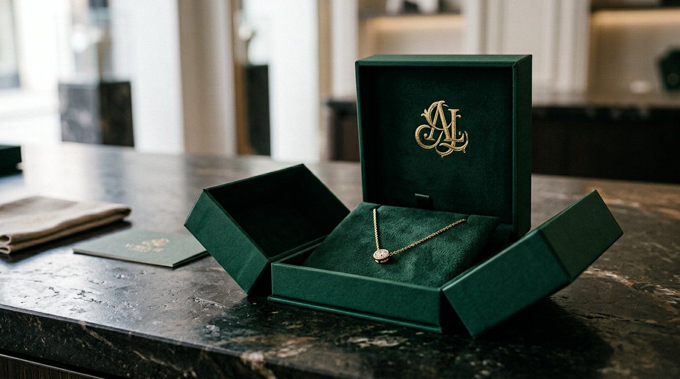
A fine-jewellery identity that trades the expected gold-and-glitter for deep emerald, quiet marks and packaging that opens like a box, not a bag.
The short answer
- Measurable impact
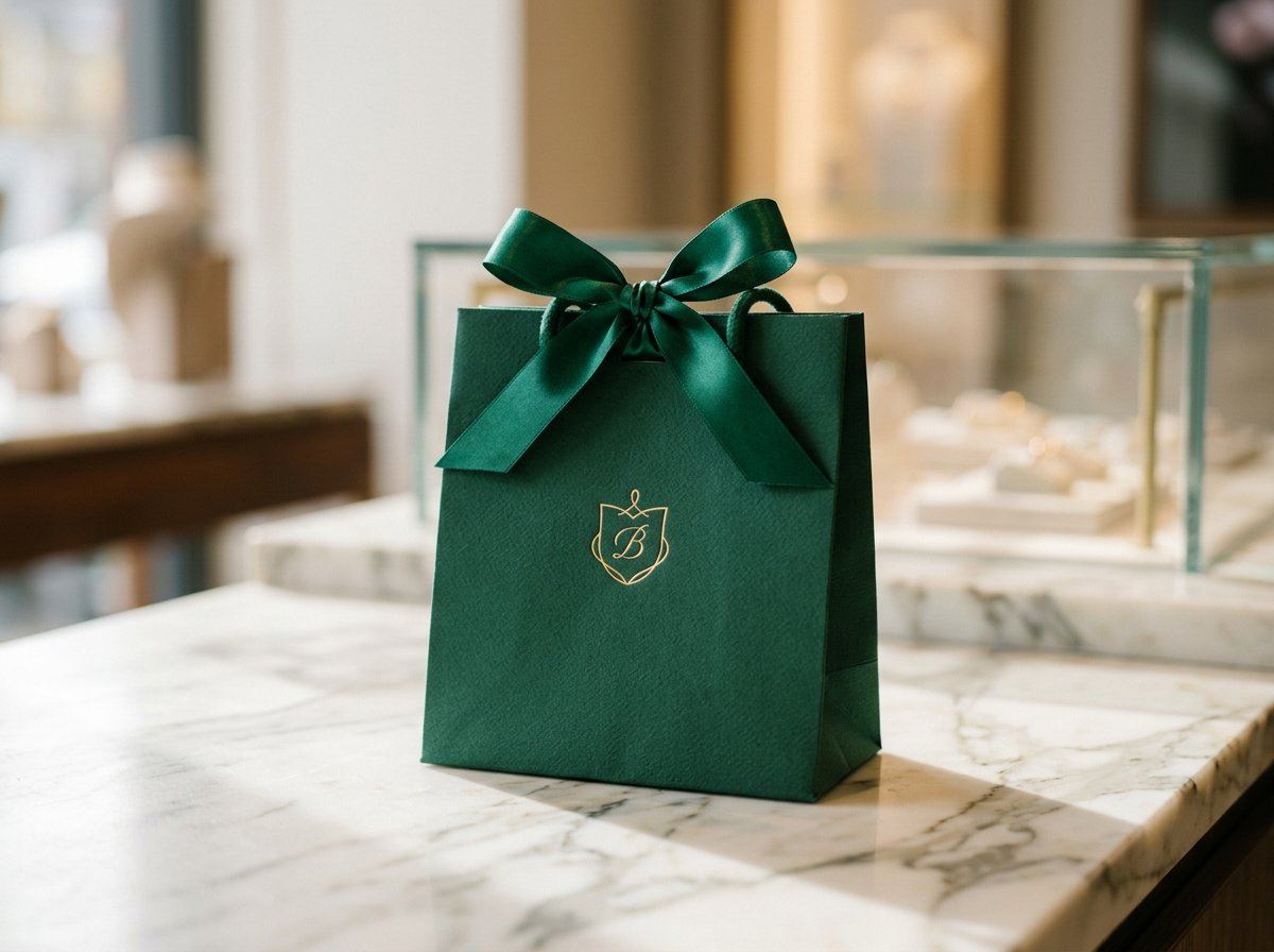
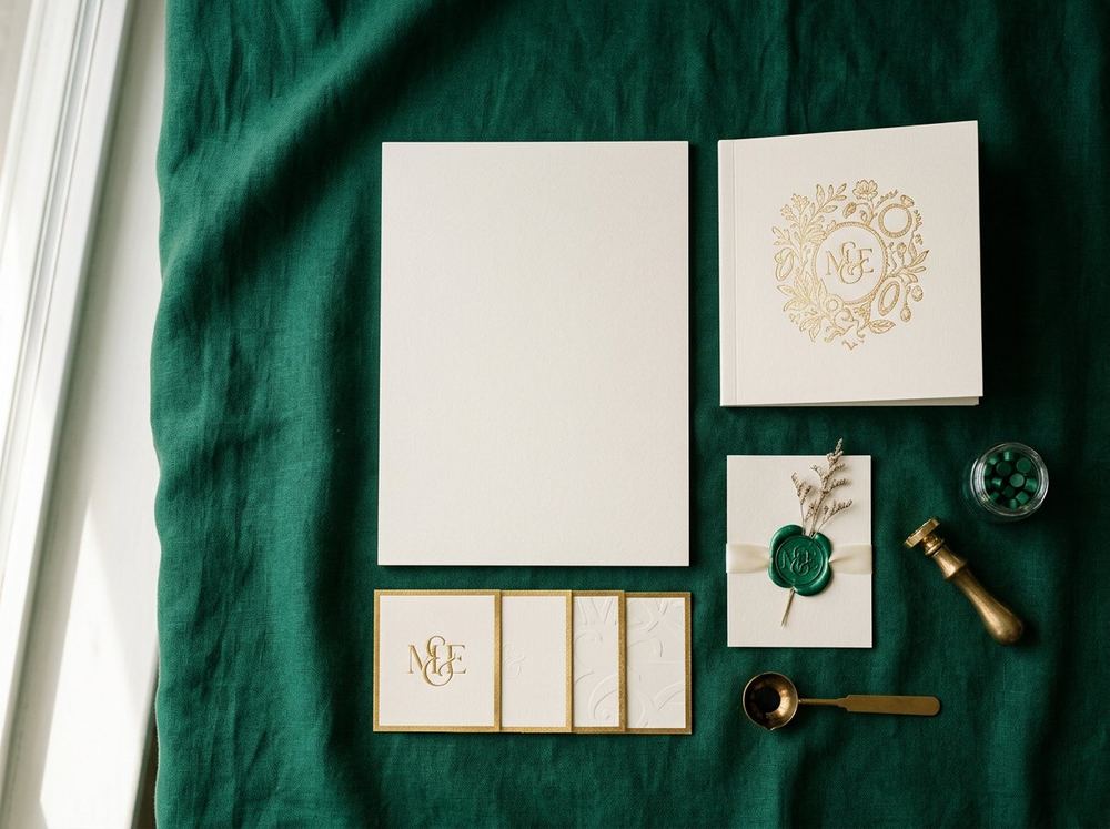
- The identity extends across jewellery packaging, bags, proposals, gifting and appraisal touchpoints through one consistent visual language.
| Client | Meera Jewels |
|---|---|
| Sector | Fine Jewellery |
| Category | Branding |
| Year | 2026 |
| Services | Brand identity, Packaging suite, Stationery system, Lookbook direction |
What stood in the way
Meera's craftsmanship was heirloom-grade, but the brand presented itself like every other showroom on the street: yellow gold everywhere, ornate script, plastic carry bags — the exact opposite of how the pieces feel in the hand.
The idea behind it
We inverted the category. Emerald board with a small gold mark, a monogram used at one size, and a box structure that opens flat so the piece is met, not dug out of. Stationery follows one grid; the lookbook is shot on the same stone as the identity photographs.
How it came together
Related work
Behind this project: our Brand Identity Design service. Questions? Read the FAQ or start a project.
Ready ToLaunch YourNext Brand?
Tell us about your product, audience and launch date. We define the scope first, then quote a fixed price.
