Banjara Brew Co.
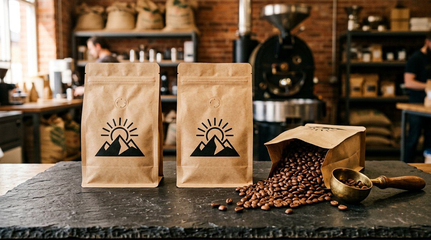
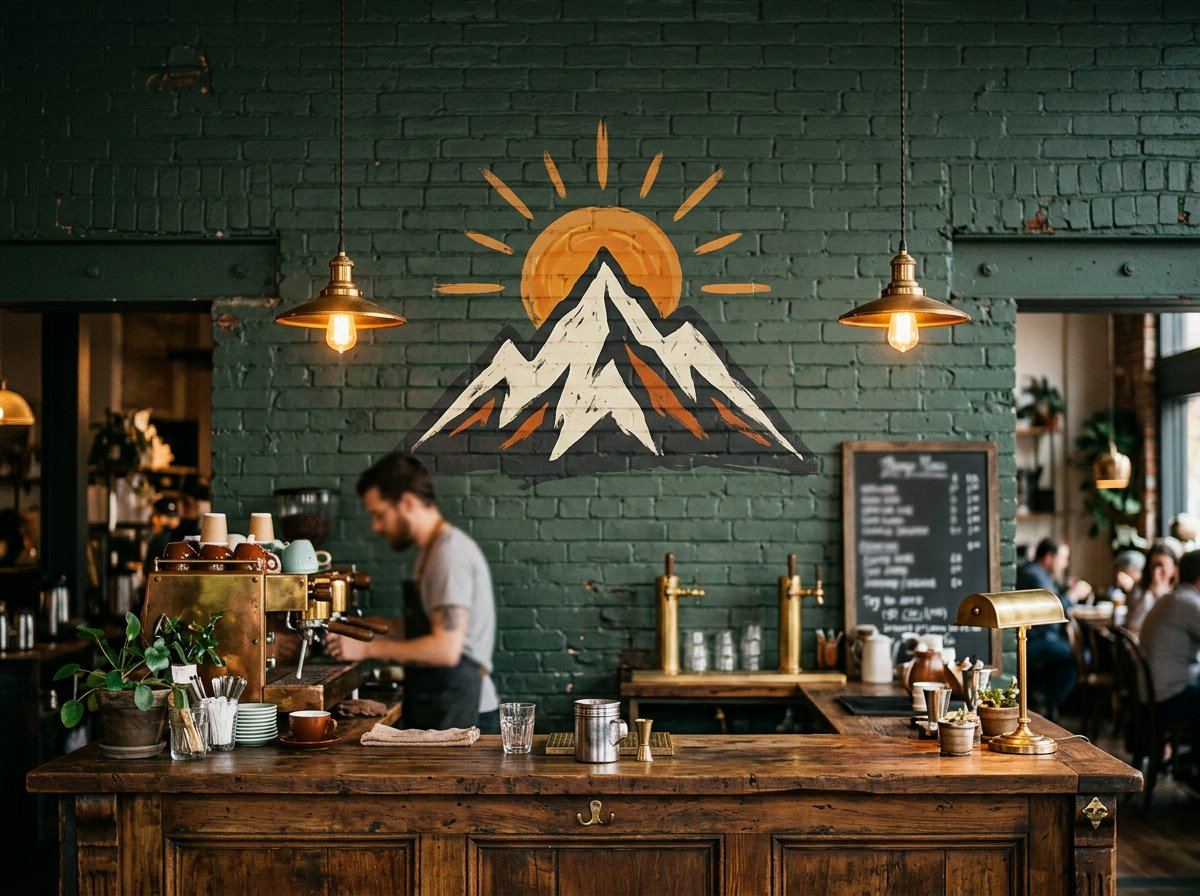
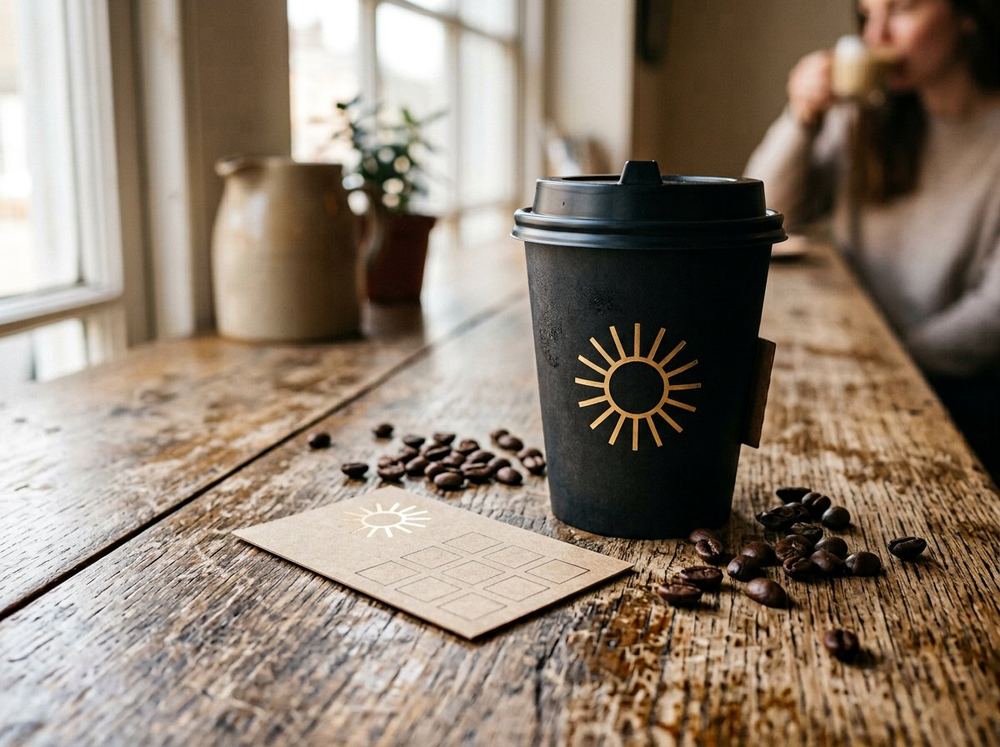
A roastery identity built from one hand-drawn mark — a sun rising over the Banjara hills — that has to work on a bag, a wall and a paper cup.
The short answer
- Measurable impact
- The identity is designed to translate across coffee bags, signage, cups and printed collateral as one consistent visual system.
| Client | Banjara Brew Co. |
|---|---|
| Sector | Coffee & Hospitality |
| Category | Branding |
| Year | 2026 |
| Services | Brand identity, Packaging design, Café signage, Collateral system |
What stood in the way
Banjara Brew roasted in small batches and sold through three cafés with three different signages, three cup designs and no mark a customer could recognise from across the street.
The idea behind it
One mark, drawn once and then constrained on purpose: it must read at 300 mm on a painted brick wall and at 20 mm on a loyalty card. Kraft bags carry it in a single ink, the café wall in paint, cups in matte black — the same geometry every time, so recognition comes from shape rather than colour.
How it came together
Related work


Behind this project: our Brand Identity Design service. Questions? Read the FAQ or start a project.
Ready ToLaunch YourNext Brand?
Tell us about your product, audience and launch date. We define the scope first, then quote a fixed price.
